

Softcare Skin
PROJECT OVERVIEW
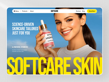
Softcare Skin — Science-driven skincare brand website with bold visual identity and product storytelling.
Science-driven skincare brand website with bold visual identity and product storytelling.

PROBLEM
The challenge behind Softcare Skin
The brand lacked a digital presence that matched its science-backed positioning and premium product line.
SOLUTION
How we solved it for Softcare Skin
We created a bold editorial website with ingredient storytelling, interactive product pages, and a custom CMS.
PROCESS
The design process behind Softcare Skin
01
Discovery & research
- User journey review
- Pain point mapping
- Checkout drop-off analysis
02
Structure & user flow
- Core flow planning
- Navigation structure
- Wireframing key screens
03
UX & UI design
- Product page design
- Checkout experience
- Visual hierarchy
04
Refinement & delivery
- Component consistency
- Final mockups
- Handoff-ready screens
RESEARCH
UX Research & Design Artifacts
SERVICES
Designing a better experience for Softcare Skin
The project was redesigned to make the experience feel quicker, clearer, and easier to complete. The focus was on reducing hesitation across the journey.
By simplifying key steps, improving hierarchy, and surfacing important details earlier, the experience became more predictable and less frustrating for everyday use.
RESULTS & OUTCOMES
Results & Outcomes
The redesign improved how users move through the product experience. By making choices clearer, surfacing useful information earlier, and reducing friction, the product became easier to use from start to finish.
+62%
Online revenue
+41%
Time on site
+29%
Return visitors